
CLIENT
RadioPublic
DISCIPLINES
Product Design, App Design
INFO
RadioPublic builds and operates world-class listening apps for podcasts focused on curated discovery, and powerful features that help listeners and podcasters alike.
Initial Problem
Building on 3 years of knowledge making and refining the app, we found a lot of built up energy over fixing some of the UI that wasn’t working, adding in features we hadn’t fully gotten implemented, and refining the app from a visual perspective to go along with other products we are planning on launching in 2019.
My Solution
Starting in the app, I refined from the ground up, every component and button, everywhere in an effort to refresh the experience. We had extensive design debt from multiple parties working on the first version, so I got started implementing a design system across all of our app and web properties.
The design's intent was to much more context into the app. From here on out, we focus on giving the listener more context about the show, the episode, a station a playlist or a folder.
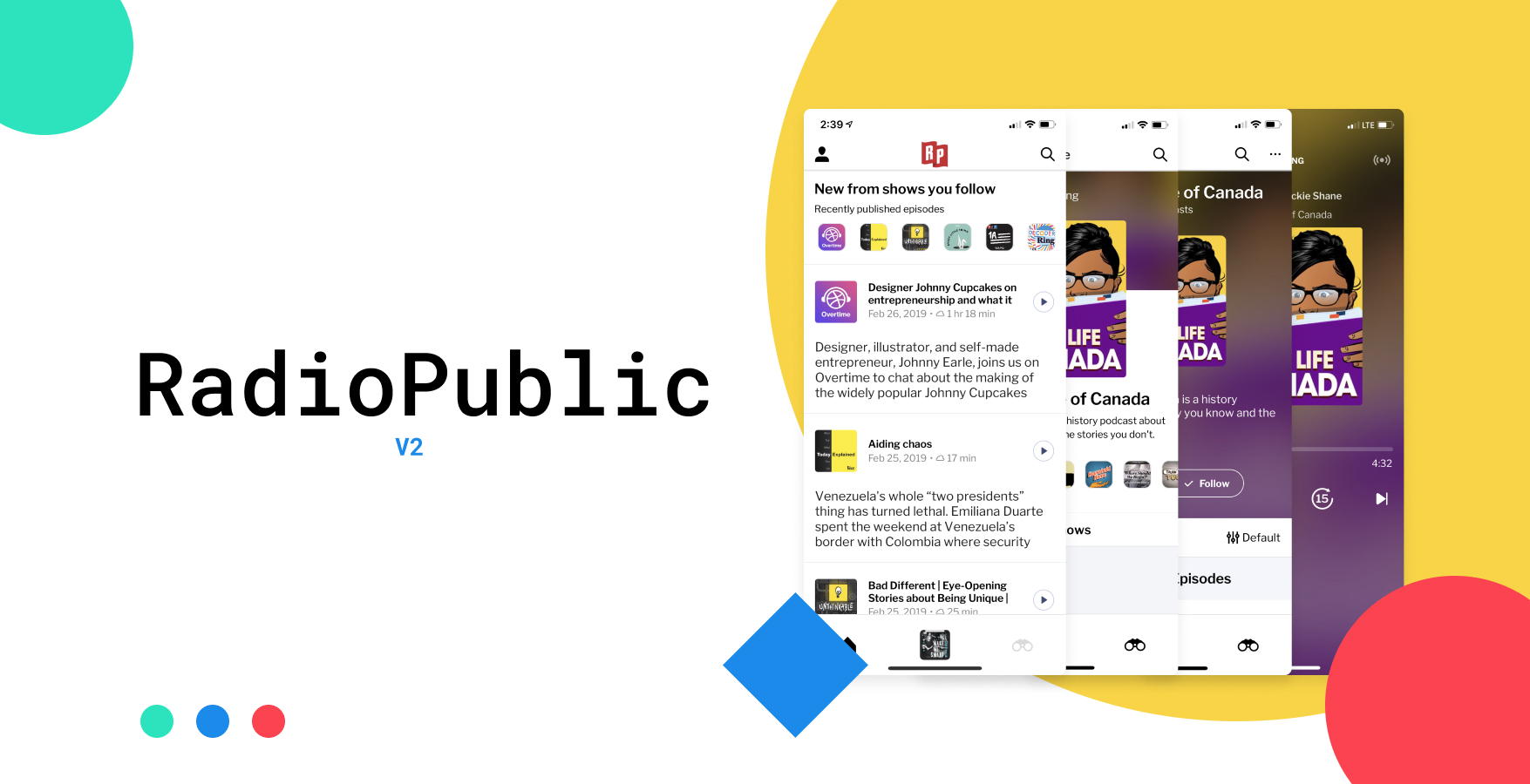
My focus on home screen to give full agency to the user, removing any semblance of our curatorial aspect, resigning that to our explore section. We added featured episodes, sorting, and filtering of shows and epsiodes.
We revamped explore and show layouts with large bold artwork spaces. We standardized interactions with color and shape, to promote similar actions to similar interactions.
Principles
The new design is based on principles for listening behavior.
We’ve focused on a few things:
- Make it easier to curate your own listening. The first screen upon opening the app fresh each day delivers your followed shows and episodes, quickly and efficiently.
- Encourage podcast discovery through listening. Building upon the release of stations for iOS last spring, we wanted to make similar lean-back listening and discovery possible with our hand-curated selections throughout the app.
- Smoothly transfer from web discovery to in-app subscription. Wherever a podcast uses a RadioPublic show link or embed player on the web, the steps to download, follow, queue, and listen are as seamless as they can be.
- Improve design and interaction consistency. Web, iPhone, and Android are now all unified and utilize similar design components.
Design System
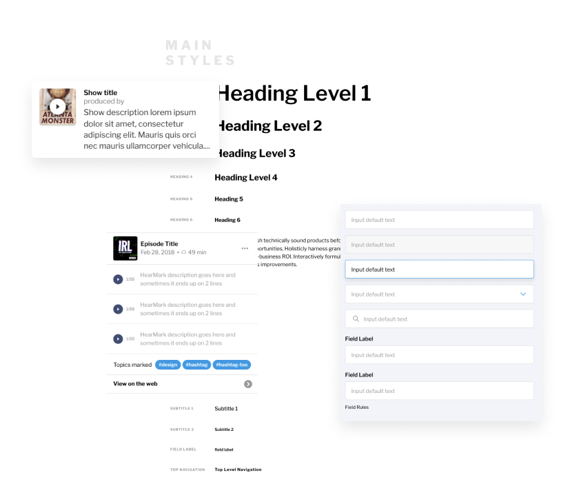
My want was to build a design system that helped support native and web apps, and gave us the consistency we needed to move at a faster pace.
I redesigned our type, color and style stack, gave consistency to icons, buttons, components, using the atomic design methodology. All of this helped a product with disparate pieces come together as a single entity.

Home
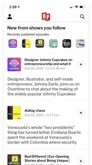
Focus on displaying episodes clearly, episode descriptions are prominent, and actions are simple. Tap play to start play, swipe to add to your queue.
Your first view upon opening the app is all about you and your podcasts. You can customize the folders on your Home screen, including the view (show or episode) to keep all your favorites organized and close at hand. We removed highlights and recommendations from Home, keeping discovery browsing and suggestions in Explore instead.

Queue
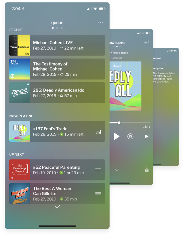
There’s a whole new view here: you can now drag new episodes up into the Now Playing spot, which moves the old episodes into the Up Next spot. Adding episodes to the queue is now a single-handed action: swipe left to right on any episode name anywhere in the app to quickly add to your queue. From an episode card, you now have the option to add it to the Next or Last spot in your queue

Explore
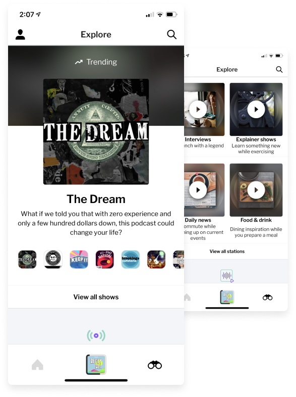
RadioPublic users love our hand-curated podcast selections, citing that they’ve found new shows to love from our ever-changing features. Sometimes even choosing from a curated list can take more work than desired when all you really want to do is listen.
The motivation to get users closer to listening and “just push play” became part of our design all over.
I wanted to leverage all the great content and give it a space where it could shine, and a listener could get deep context of the show or episode or station.
